The Studio
The Website Studio is run by Harrison Ross from Brighton and Hove. One person doing the design, the build, the words, and the camera work, which is the whole reason the work looks the way it does.
There is a version of this business with a team, a sales process, and a retainer model. It would make more money and produce worse websites. Every project here gets designed by the person who will build it, and built by the person who wrote it.
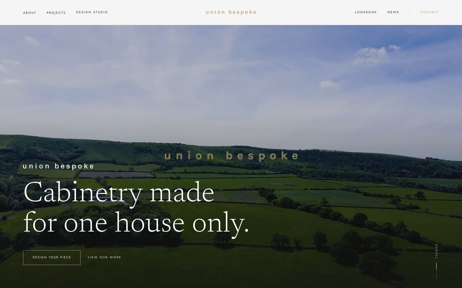
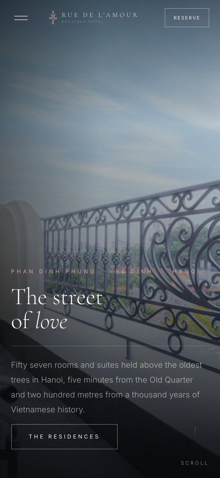
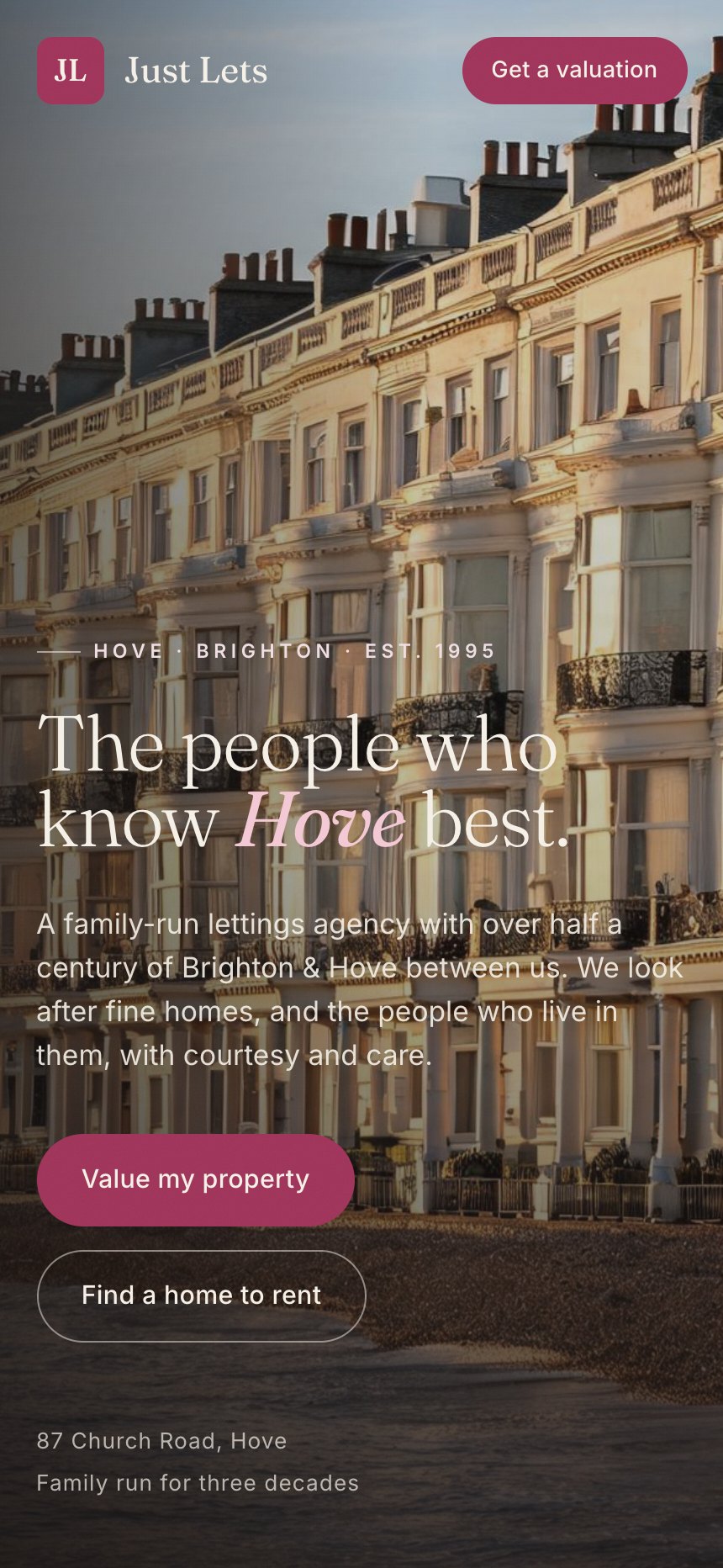
The clients are small and mid sized businesses who are competing against national brands with much larger budgets. Lettings agencies, restaurants, builders, barbers, tattoo studios, artists, kitchen makers. The common thread is that the work they do is better than the way it currently looks online.



Five things we will argue about.
The first screen decides it
Most visitors have made a judgement before they read a word. That is not a reason to write less, it is a reason to design the first screen like it is the only one.
Show the price
Every category has a convention of hiding cost behind an enquiry. Breaking it is the cheapest competitive advantage a small business can buy.
One idea per section
Texture on texture, box inside box, and four decorative devices in one band is how a site starts to hurt to look at. Each section gets one strong idea and space around it.
Real photographs of real places
A stock image of a kitchen tells a customer nothing about your kitchen. If we cannot shoot it, we do not fake it, we design around it.
It has to work on a bad signal
A site that is beautiful on a laptop on fibre and unusable on a phone on the train has failed. Mobile is designed first, every time.
Why the site looks like this.
There is no brand colour on this website. That is deliberate. Fifteen different businesses sit on these pages, each with its own palette, and any accent of ours would fight all fifteen of them.
So the studio takes the paper and the ink, and the work supplies the colour. Scroll the index and the only saturated things on the screen are client sites. That is the correct hierarchy for a studio: quiet frame, loud work.