Mencraft
Barbershop, Hove
Website design, Booking system, Photography direction
Grooming
Two, plus booking
Next.js
Four step booking
What was wrong
A barbershop paying a monthly fee to a booking platform that owned its customers, its reviews, and the entire look of the experience.
How we read the brand
The shop is precise, so the site is precise. Monochrome, a hairline grid, a wordmark set in a light grotesque, and one enormous outlined word carrying the hero. The booking flow was rebuilt inside the site rather than linked out, so the customer never leaves the brand and the shop keeps its own data.
What it does now
A booking journey that belongs to the shop instead of a platform, wrapped in something that looks like a menswear brand rather than a salon directory.
Every screen, as it really renders.
Captured from the live site at full width. Nothing here is a mockup or a flattering crop.
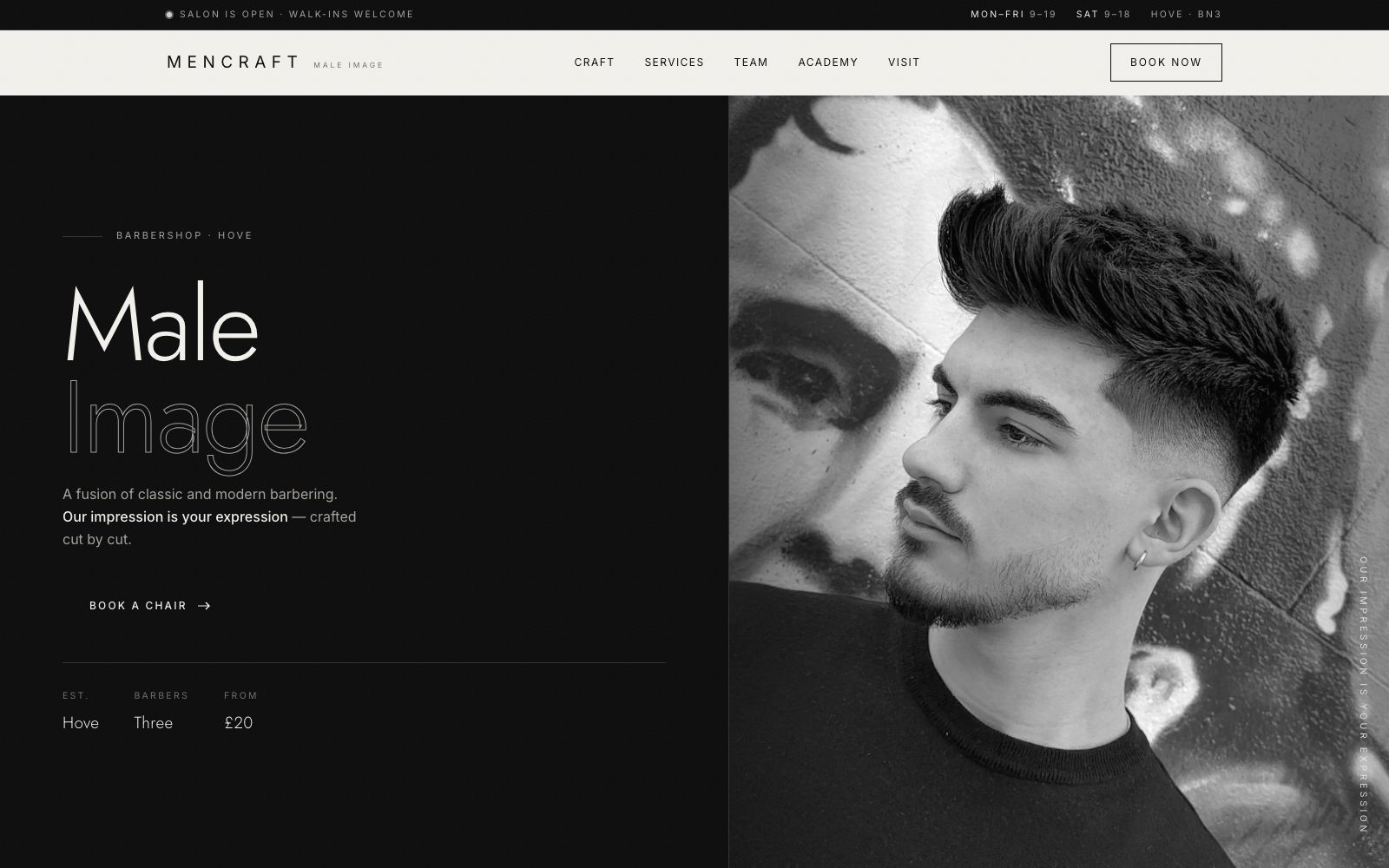
Home
Male Image set as solid and outline on the same line, which is the whole brand idea in one typographic move.
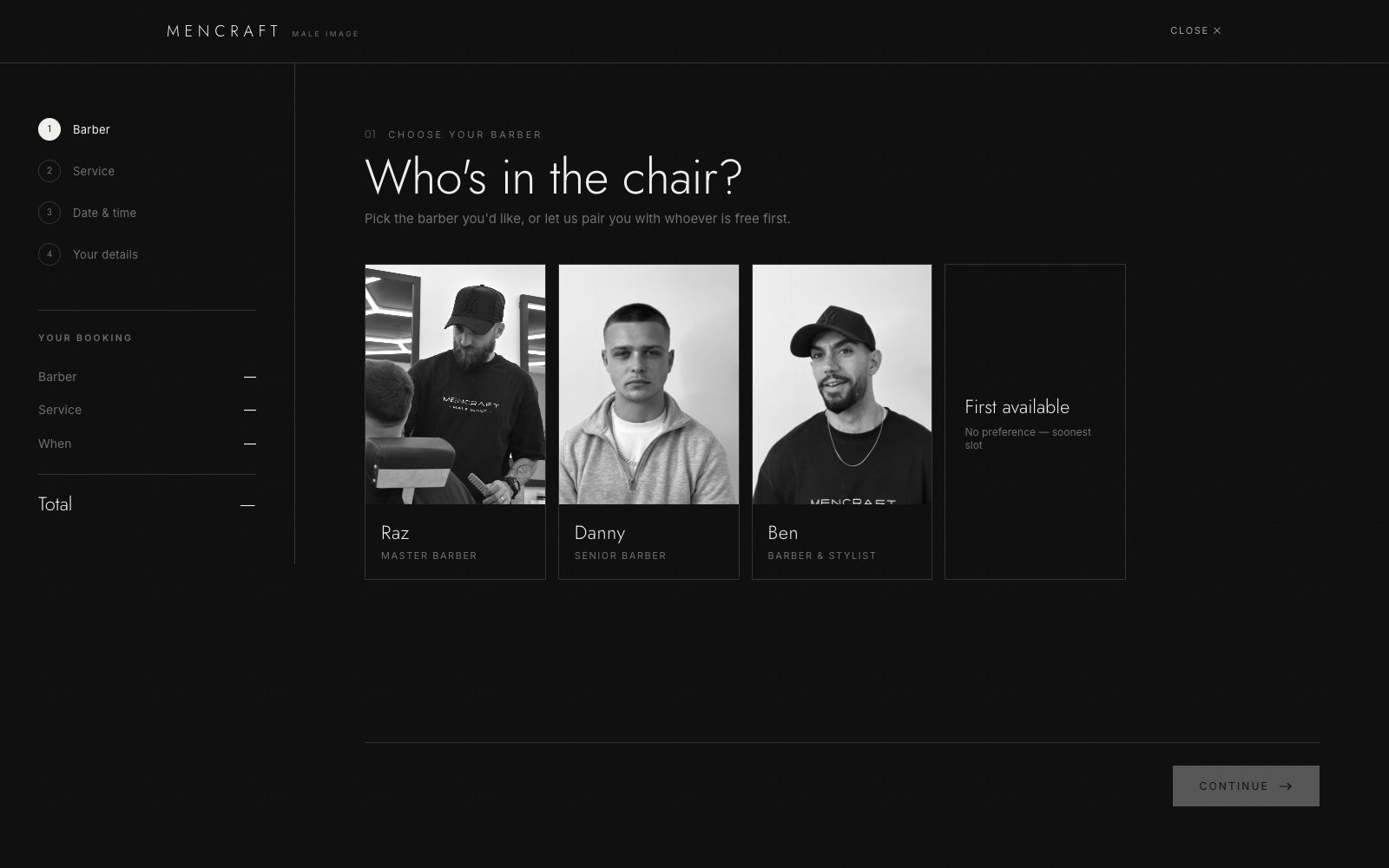
Booking
Four steps: service, barber, time, details. Real portraits so you choose a person, not a slot.
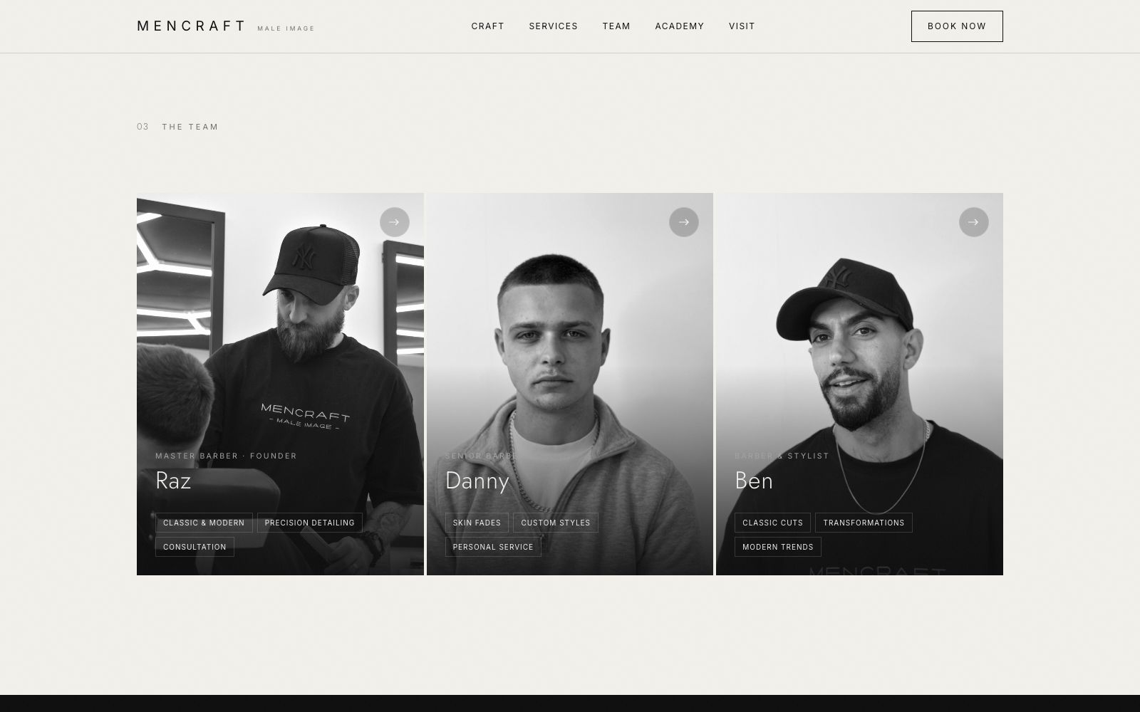
The team
Three barbers, shot the same way, with the specialisms that make people ask for them by name.
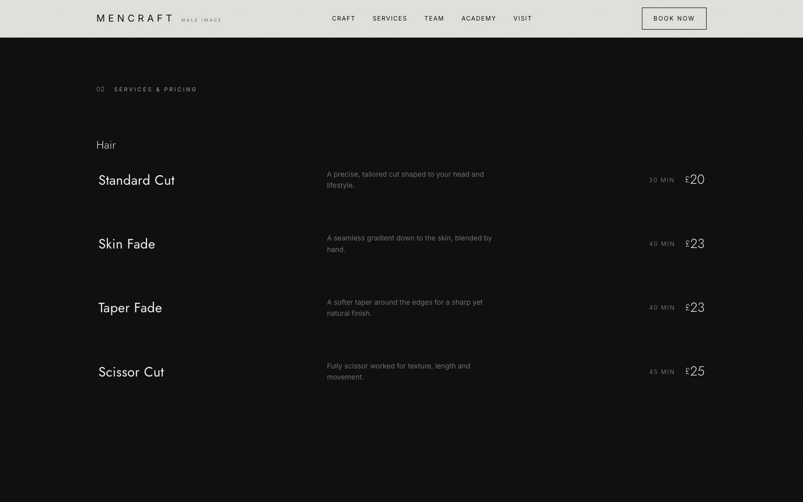
Services
Prices in full. A barbershop hiding its prices reads as expensive for the wrong reasons.
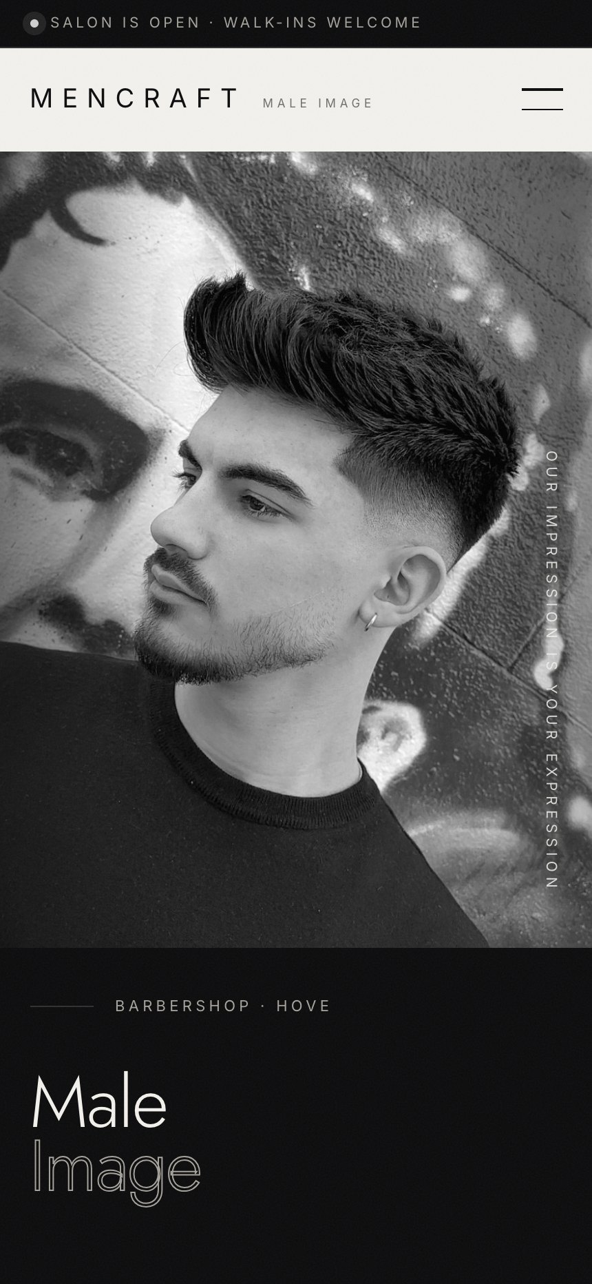
On a phone
Most of the traffic to a site like this arrives on a phone, so the mobile layout is designed first and the desktop version follows it.
The same site at 430 pixels wide. Type resizes rather than shrinks, the navigation collapses into something you can reach with a thumb, and every image is served at a size that will actually load on mobile data.