Harman Building & Carpentry
Extensions and Carpentry, Worthing
Website design, Project Planner, Lead dashboard, Copywriting
Construction
Project Planner
Static, hand coded
Scored lead dashboard
What was wrong
A City and Guilds carpenter running extensions and refurbishments across West Sussex, losing whole days to quoting jobs that were never going to happen, on a domain that had gone dead.
How we read the brand
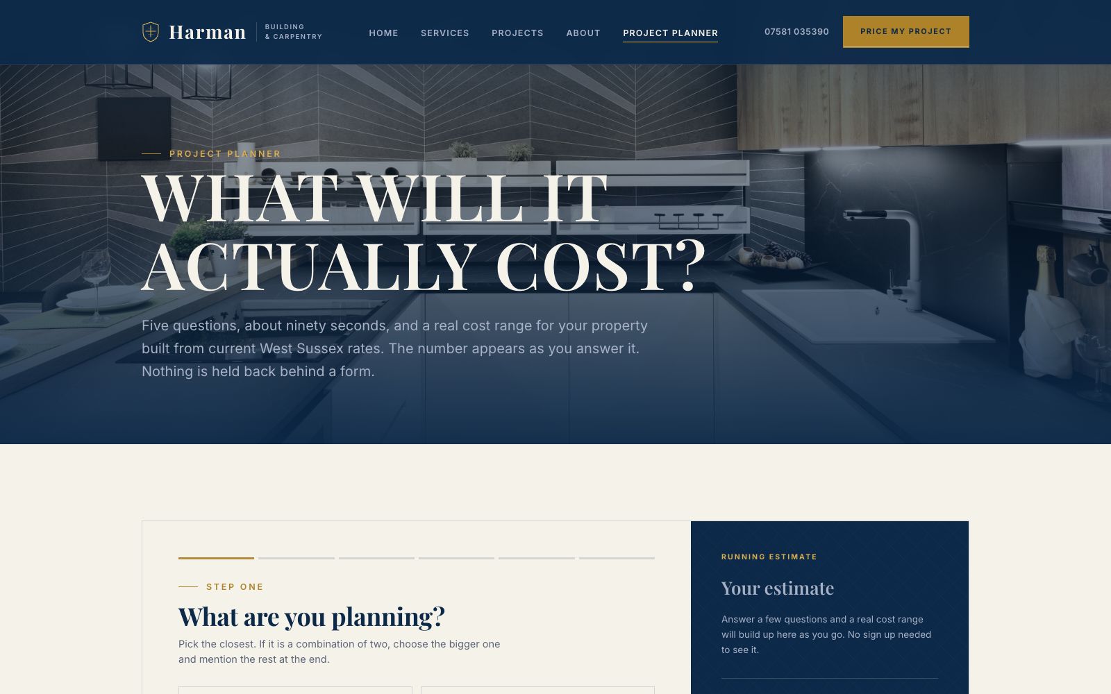
The site is built around one page: the Project Planner. Five questions, about ninety seconds, and a real cost range for the property builds up on screen as you answer, from current West Sussex rates. Nothing is held back behind a form. The rest of the site is deliberately upmarket, Didone and gold over real photography of the houses he has worked on, because a builder who looks expensive gets asked for the bigger jobs.
What it does now
Enquiries now arrive with the job type, the property, the timeframe, and a budget band already attached, and land in a dashboard that scores and sorts them. The people who saw the range and left were never going to book a survey.
Every screen, as it really renders.
Captured from the live site at full width. Nothing here is a mockup or a flattering crop.
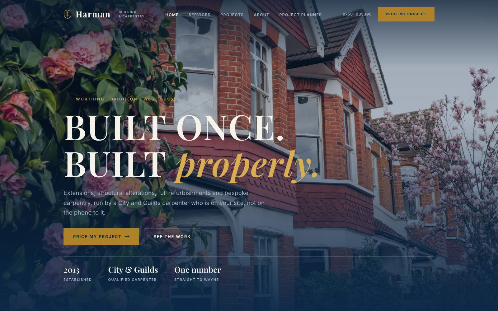
Home
Built once, built properly, over a real house he worked on. The planner is in the nav from the first screen.
The Project Planner
Five questions and a live cost range. The estimate builds as you answer rather than arriving by email.
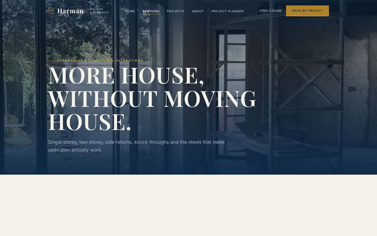
Extensions
One service page per job type, each ending in the planner rather than a generic contact form.
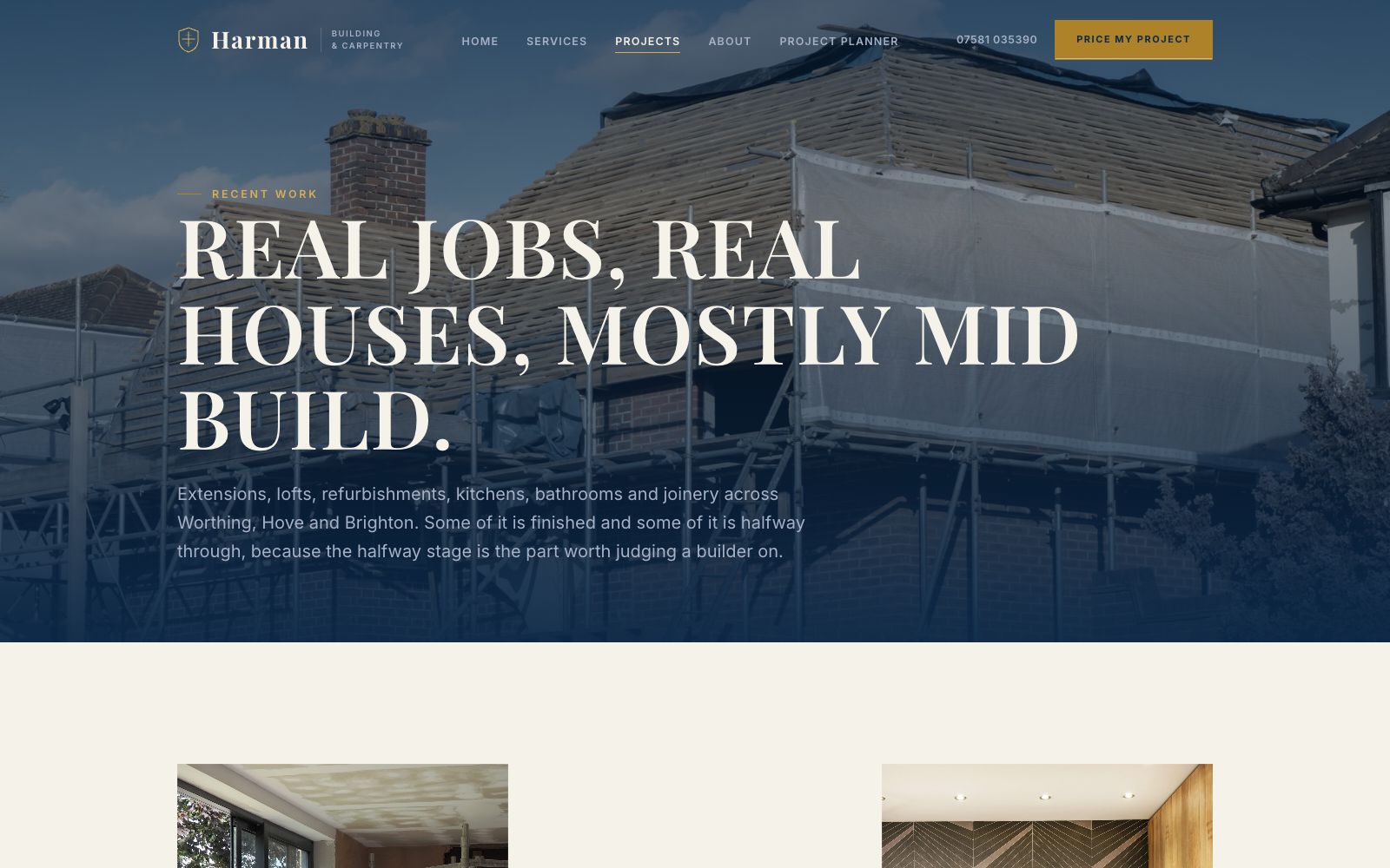
Projects
Real jobs with real addresses. In this trade, local proof beats a national accreditation badge.
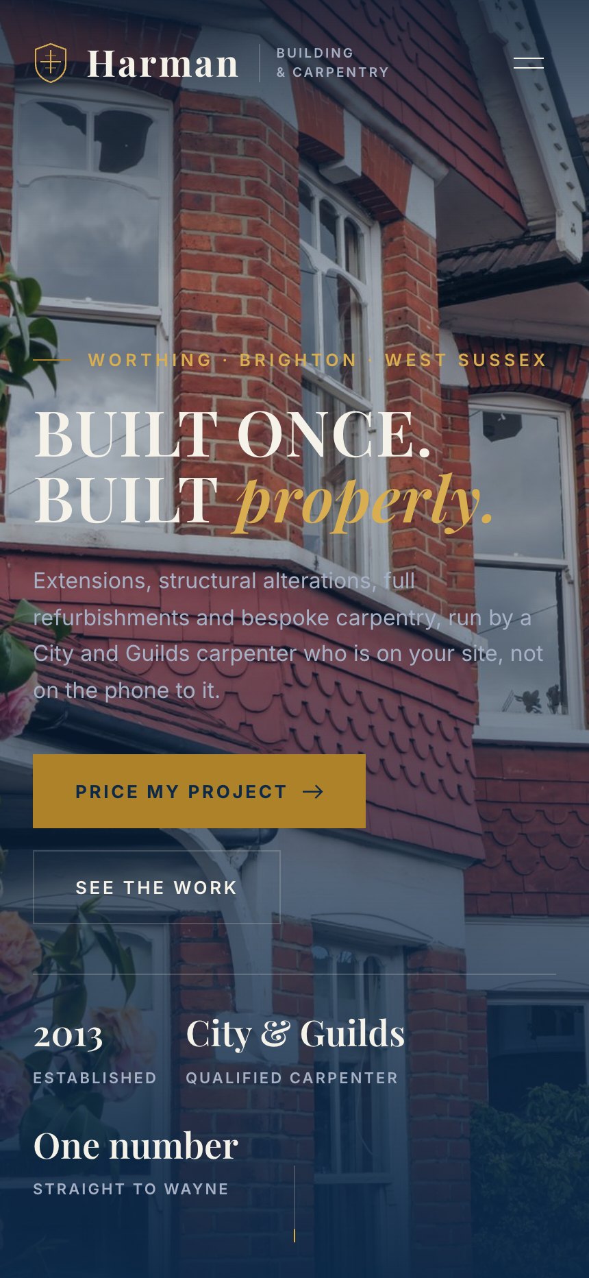
On a phone
Most of the traffic to a site like this arrives on a phone, so the mobile layout is designed first and the desktop version follows it.
The same site at 430 pixels wide. Type resizes rather than shrinks, the navigation collapses into something you can reach with a thumb, and every image is served at a size that will actually load on mobile data.