Liza Giles
Abstract Painter, London
Website design, Art direction, Print shop build, Copywriting
Fine art
Nine
Static, hand coded
Split panel hero
What was wrong
Liza shows with Flowers Gallery and sells serious work, but the site was a stock template that flattened every painting into a thumbnail. The paintings had to become the interface, not the content inside it.
How we read the brand
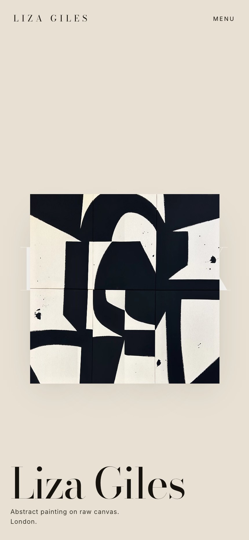
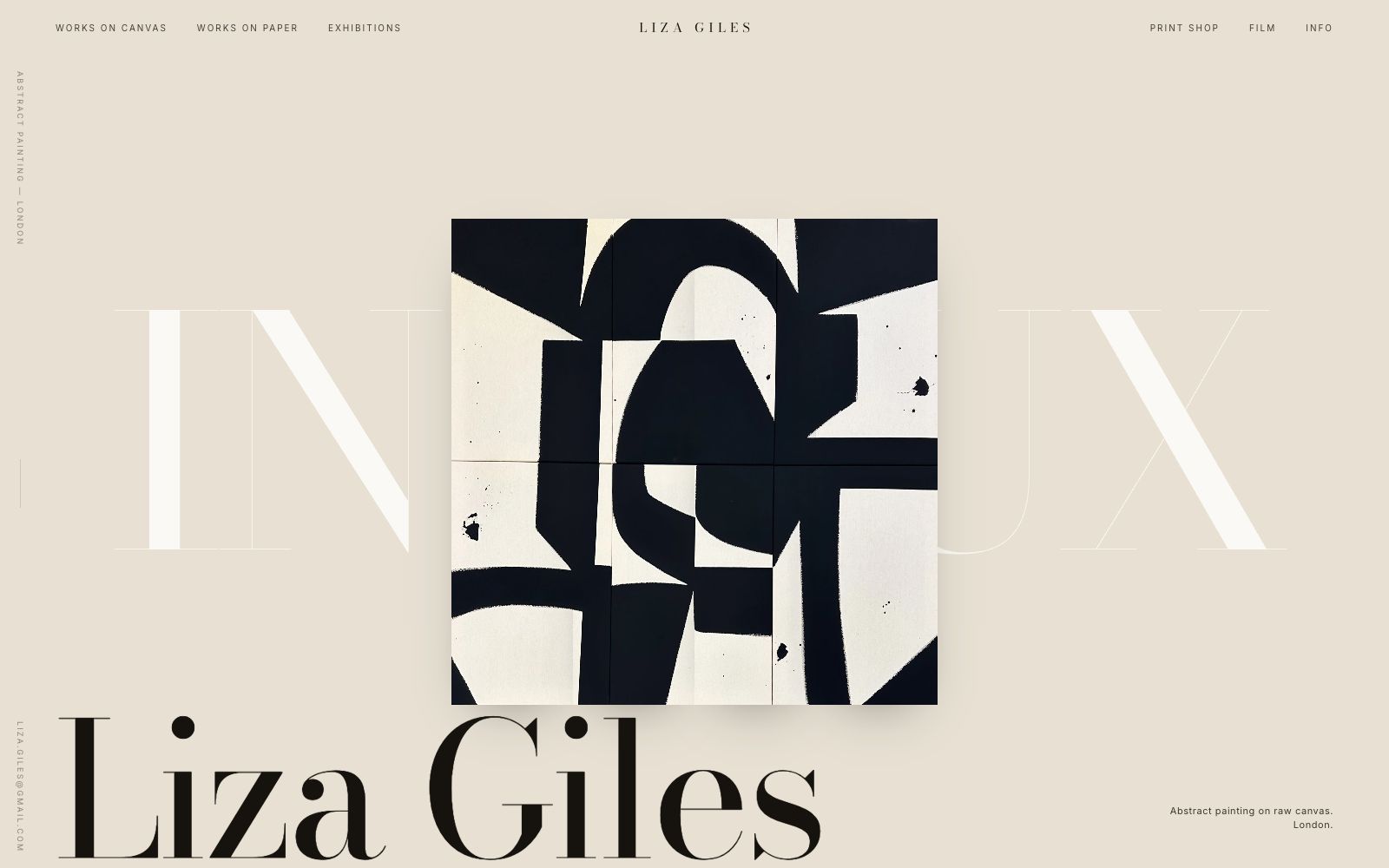
Her work is raw canvas, torn edges, and hard blocks of colour, so the whole site was built out of blocks. The hero is one painting cut into panels that drift apart as you scroll, which is the same gesture as her collage method. Everything else stays out of the way: bone paper, one hairline rule, and a display serif set large enough to feel like a catalogue cover.
What it does now
A site that reads as an exhibition rather than a shop, with a print shop attached that sells editions without ever breaking the gallery tone.
Every screen, as it really renders.
Captured from the live site at full width. Nothing here is a mockup or a flattering crop.
Home
The painting is cut into panels that separate on scroll, so the first interaction on the page is the artwork moving.
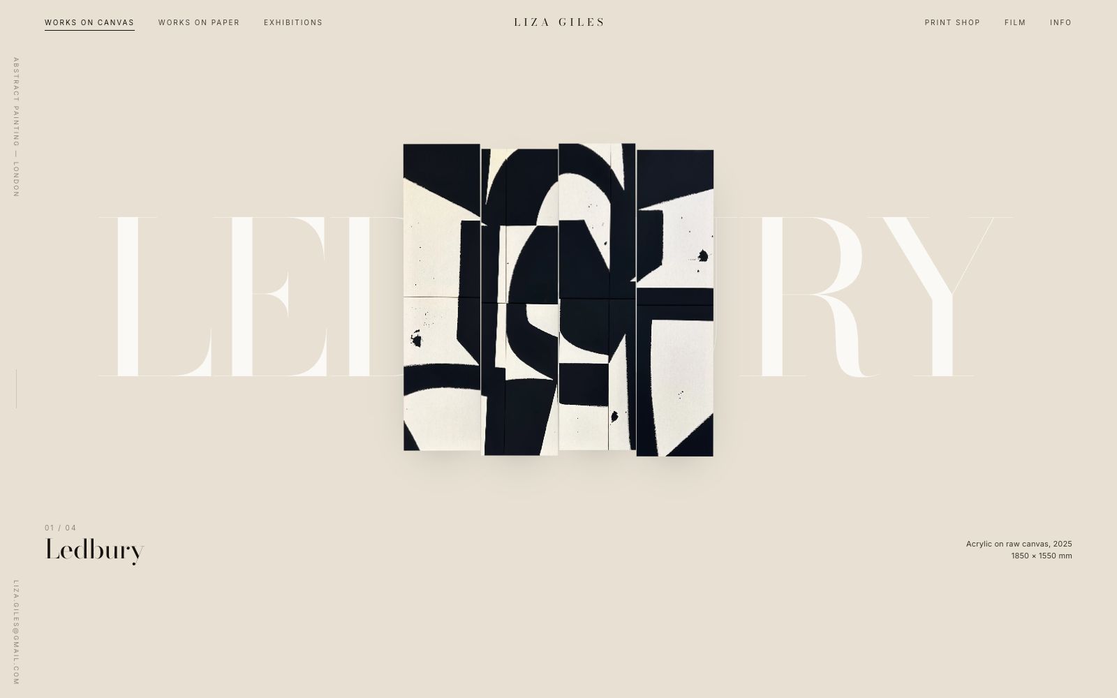
Works on canvas
A single column of large plates. No grid, no hover cards, nothing that turns a painting into a product tile.
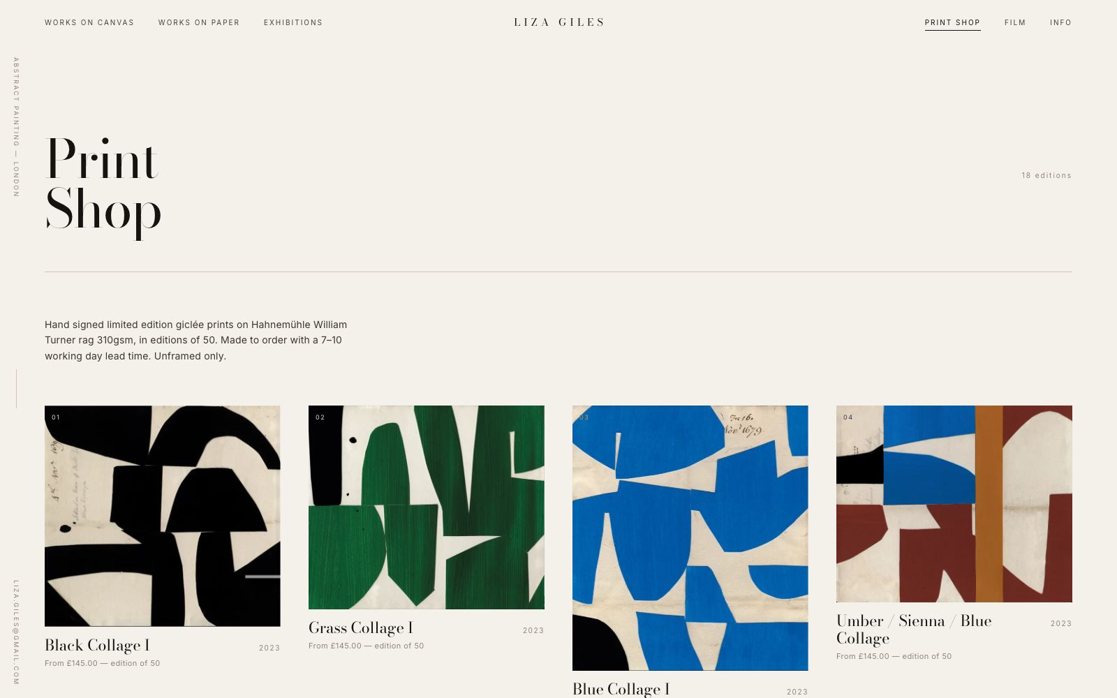
Print shop
Editions priced openly with paper stock, edition size, and lead time stated before anyone has to ask.
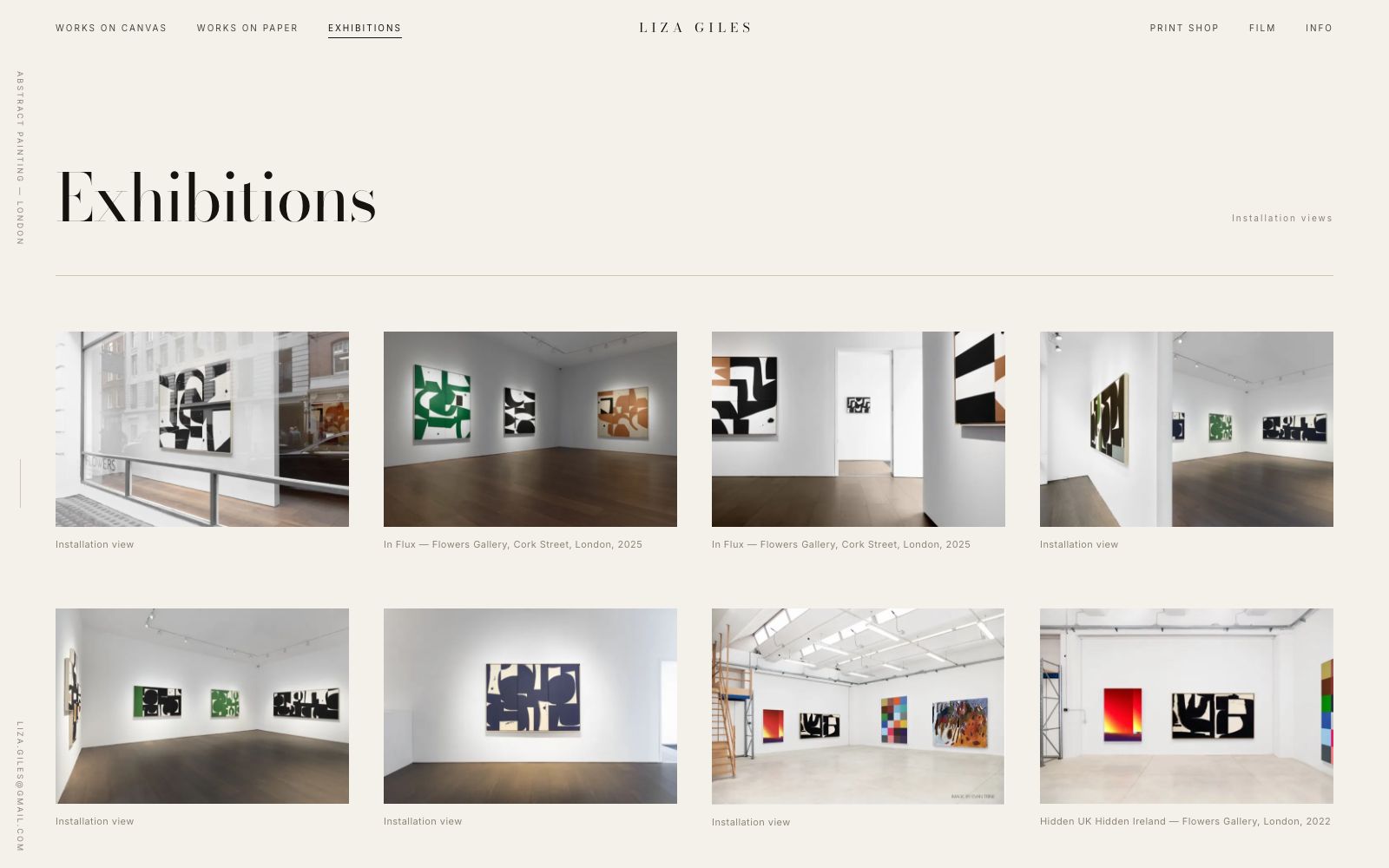
Exhibitions
A dated list set like a CV, because that is what collectors and galleries actually scan it for.
On a phone
Most of the traffic to a site like this arrives on a phone, so the mobile layout is designed first and the desktop version follows it.
The same site at 430 pixels wide. Type resizes rather than shrinks, the navigation collapses into something you can reach with a thumb, and every image is served at a size that will actually load on mobile data.